Deliveroo

Product Introduction
Deliveroo is a food delivery company that serves as an intermediary between customers and restaurants. As Deliveroo grew in the UK, it expanded operations to most of Western Europe.
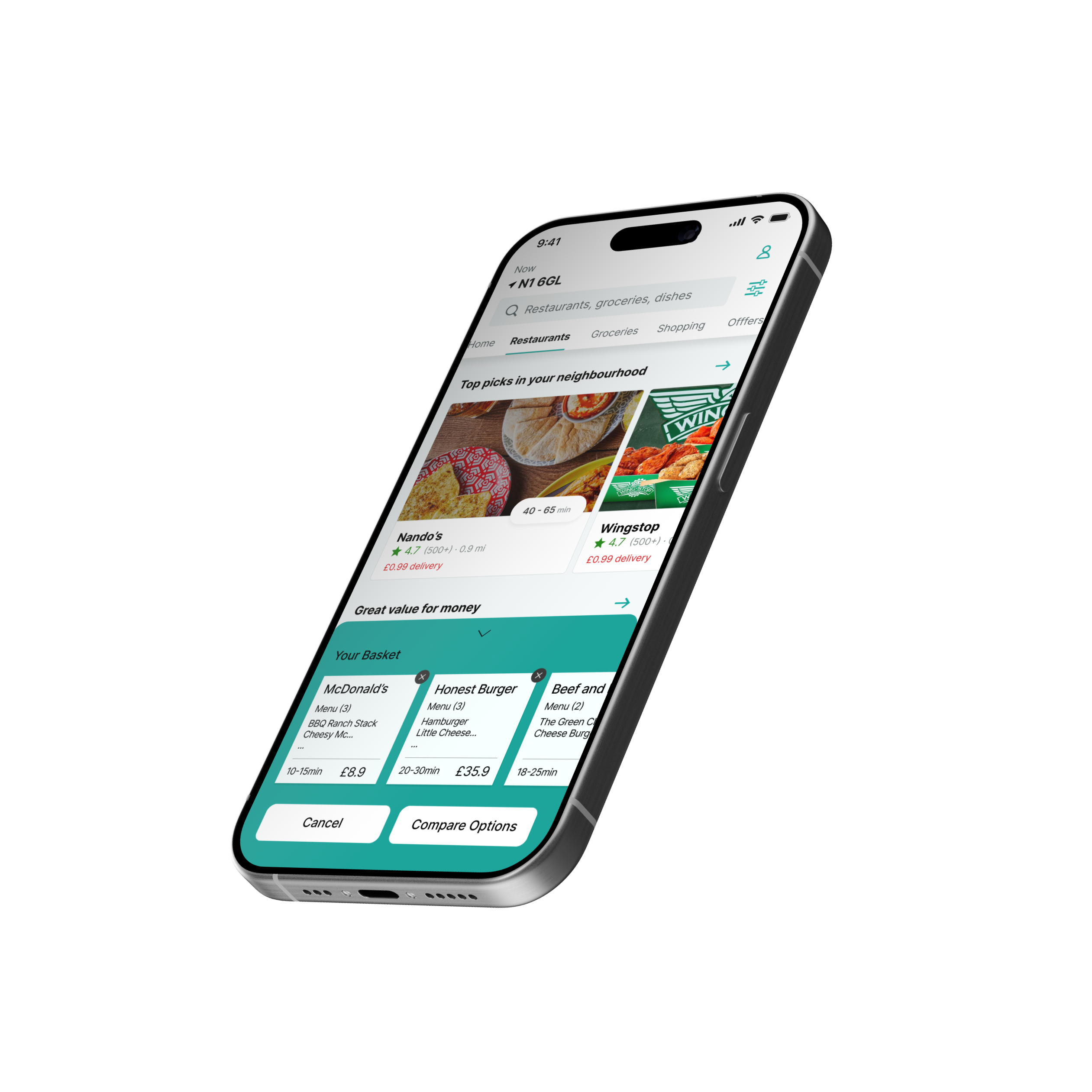
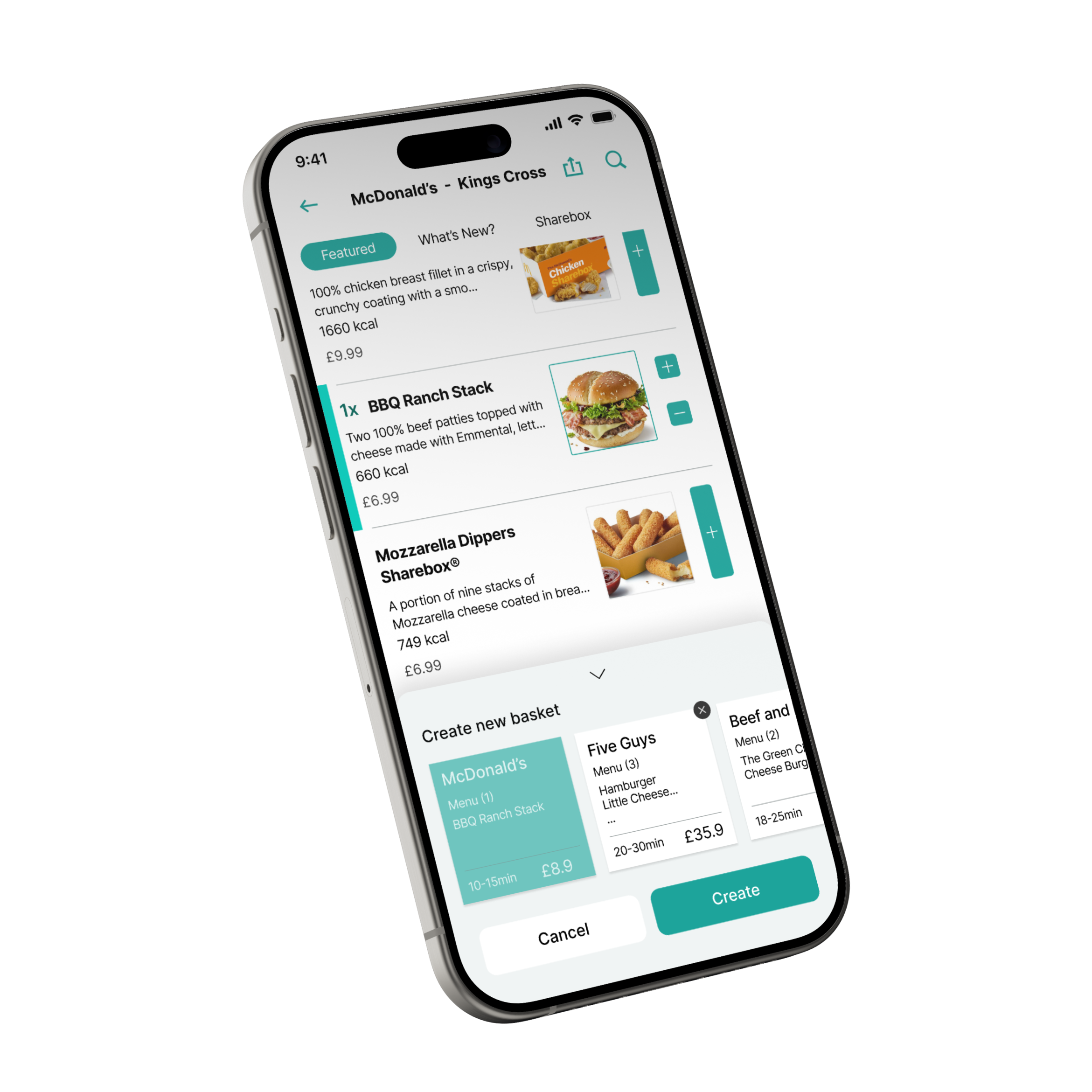
Redesign  / UXUI
Redesign Deliveroo app
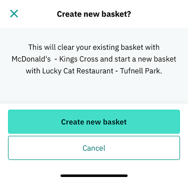
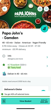
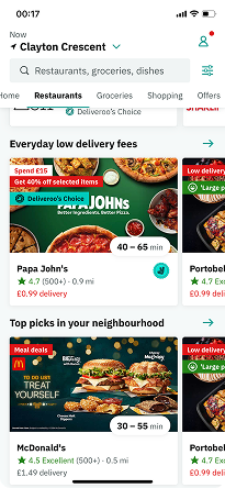
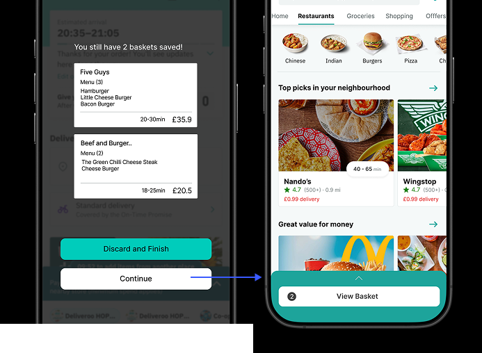
Case study, Data analyzing
Target User
Current
Deliveroo user
Problem Statement
Current Basket system restricts users' freedom to select and effectively compare restaurant options. With this system, users must delete their existing cart to explore different restaurants. To return to previous selections, users face the inconvenience of having to reselect all options from the scatch. This restrictive user experience increases decision fatigue and ultimately leads to app abandonment.
Problem Preview
#01
Usability challenge
Don't Take My Basket Away
The current cart system restricts users to add items from one restaurant at a time. Existing cart and all previous selections must be emptied when users want to save items from a different restaurant's exploration.
Problem Preview
#02
Navigation challenge
Where Did My Basket Go
The main feature’s visibility becomes inconsistent across the app. When users set a cart from a restaurant page and return to the main screen, the button below showing the cart's existence disappears.
Key Features
Get Multiple Baskets
# NoMoreRepetitiveSelections
Reduces decision fatigue and enhances user control.  Based on Hick’s Law – Simplifying complex decisions by reducing cognitive load.
Users can create and manage multiple carts simultaneously, allowing them to freely add different menu options, compare estimated totals,  without losing previous selections.
Compare your Bills
# See Everything Before You Order
Before finalizing an order, users can access a detailed bill comparison page that provides a transparent view of the total price, delivery fees, service charges, estimated time, and promotions.
Based on Doherty Threshold – Faster decision-making when system responsiveness meets user expectations.
We Remember
What You Picked
# Order with confidence
A feature that remembers your previous selections—even if you navigate away and come back later. These choices are gently highlighted with color cues, so you can quickly spot what you had in mind.
No More Last-Minute Rush
# Redesign Checkout page for User Confidence
During user testing, a critical pain point emerged—users accidentally proceeded with the wrong cart.
# StayOrDelete
After checkout, users are given the option to retain or clear their carts for post-order flexibility.
# Prevent misorders by mandatory confirmation
Placed in a highly visible and accessible area, minimizing user errors  following Fitts’s Law
Process
1/4
Analyzing Current Flow
2/4
User Analysis
Market user research
Analysing the product market through key research questions examining User Decision-Making Patterns in Deliveroo App
3/4
User Interview
Qualititive Research
From Multi-App Browsing to Order Completion: Exploring the Real User Journey in Food Delivery Apps
4/4
Affinity Mapping
Design Question : How can we improve the usability on our Food delivery App to increase customer satisfaction and Easy comparition?
How might we provide a Stream lined comparision Users feel free to Consider, Compare, and Decide Conveniently?
1/4
Ideation
Impact/ Users need to touch or navigate the screen multiple times to find functions, making usage cumbersome. This can lead to safety issues, when used while driving or walking
2/4
Idea sketch
Design Question : How can we improve the usability on our Food delivery App to increase customer satisfaction and Easy comparition?
3/4
Wireframe
Impact/ Users need to touch or navigate the screen multiple times to find functions, making usage cumbersome. This can lead to safety issues, when used while driving or walking
4/4
User test & Heuristic Evaluation
High-Fidelity Wireframe – Refining the User Experience
💡 Focused on minimizing repetitive actions, enhancing order flexibility, and ensuring a seamless checkout process by applying user research insights and UX principles.