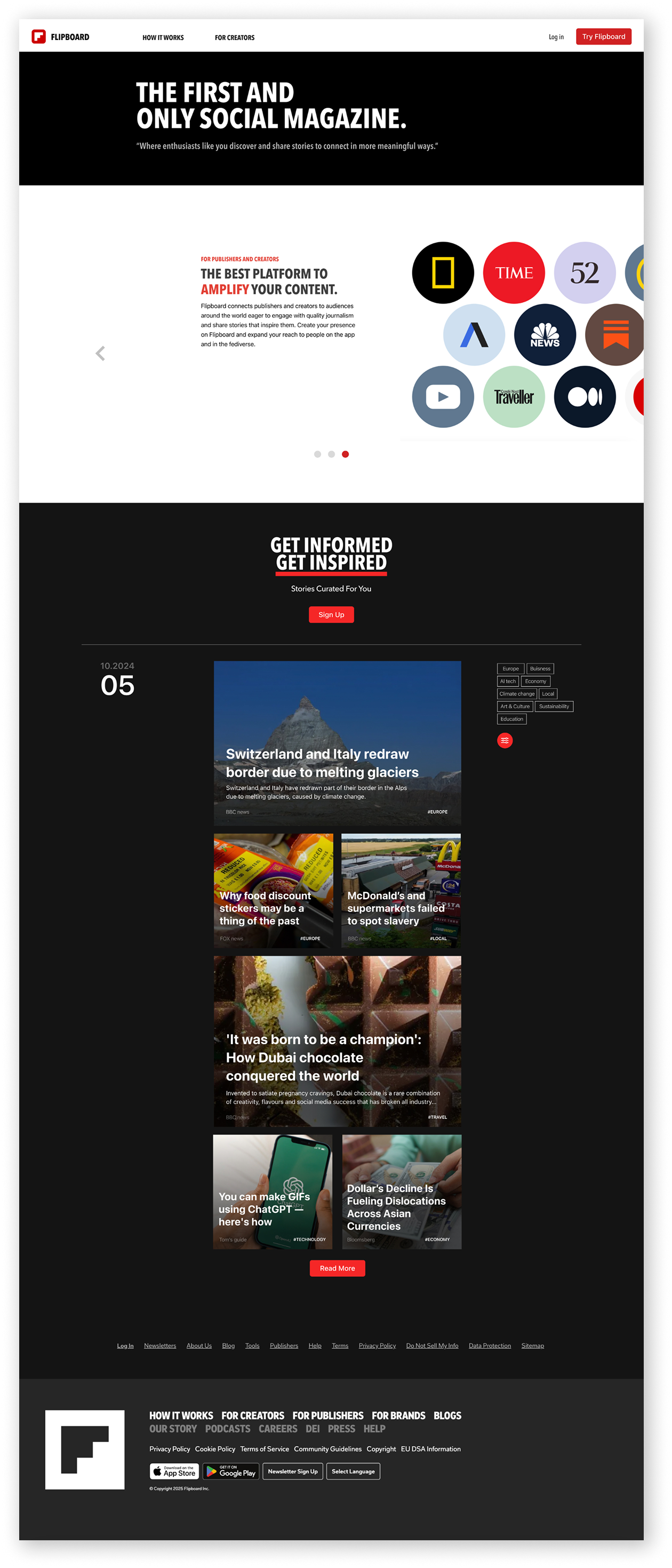
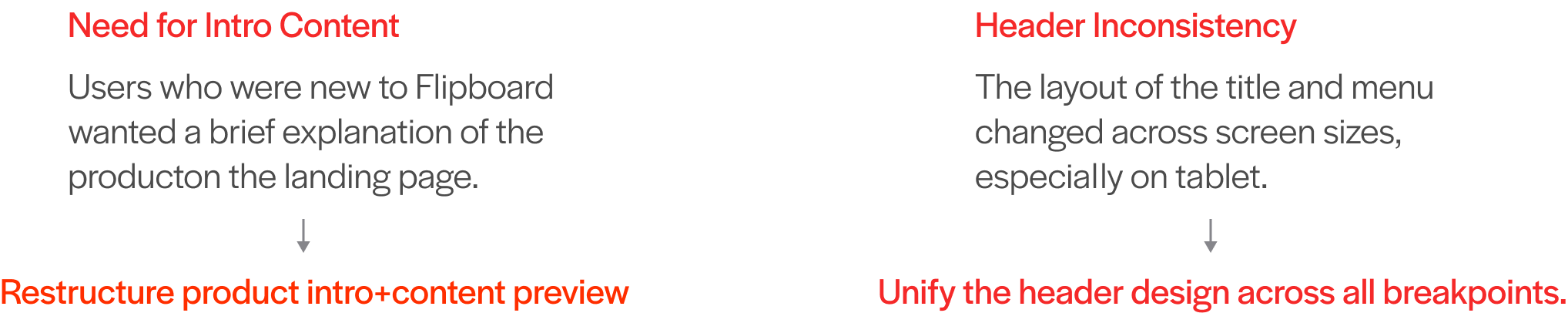
Flipboard

Product Introduction
Flipboard is a content aggregation platform that curates news, articles, and social posts into a magazine-style format.
Redesign  / UXUI
Redesign, Design System,
Web Design, UX/UI
Duration
2 weeks
Problem Statement
Flipboard is primarily an app-based product, but it also offers a web version for browsing curated news content. However, the current website makes it difficult to access this browser experience.
Most of the pages are focused on promoting the product, which limits the overall user experience—especially for those who prefer exploring content on the web.
Functional UX Issue
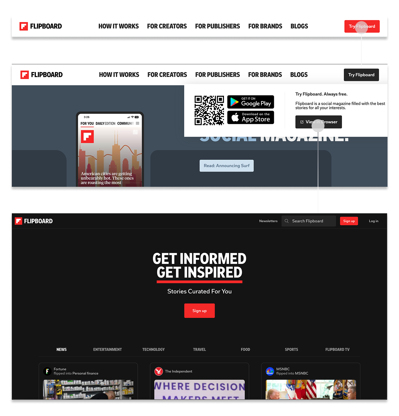
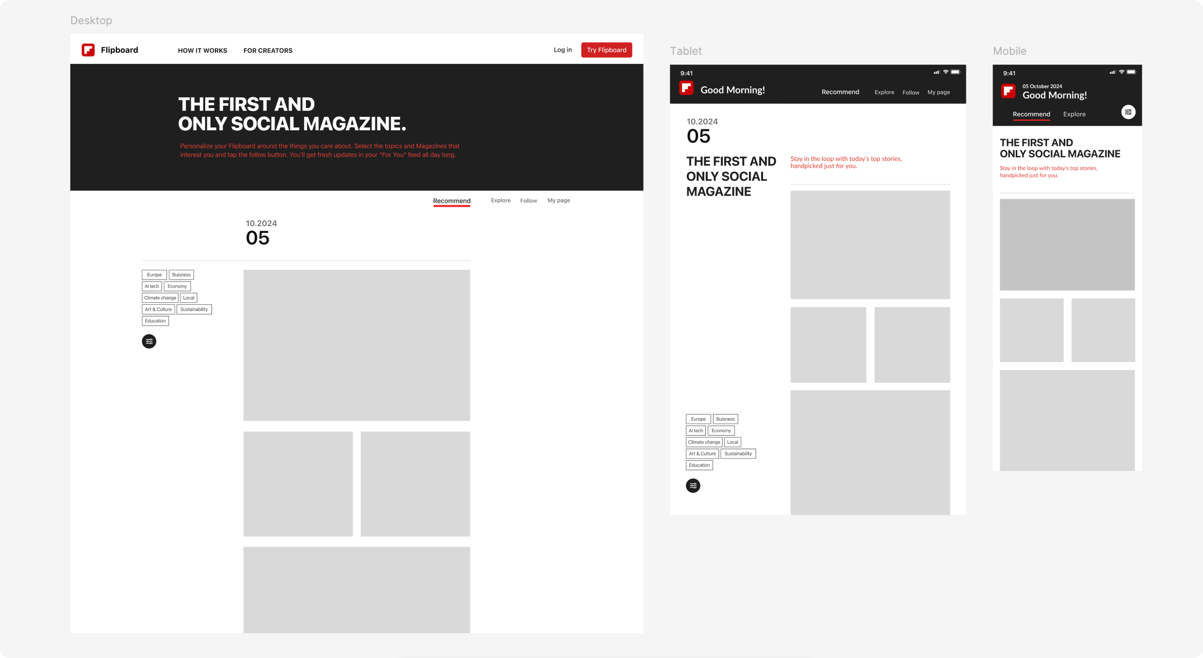
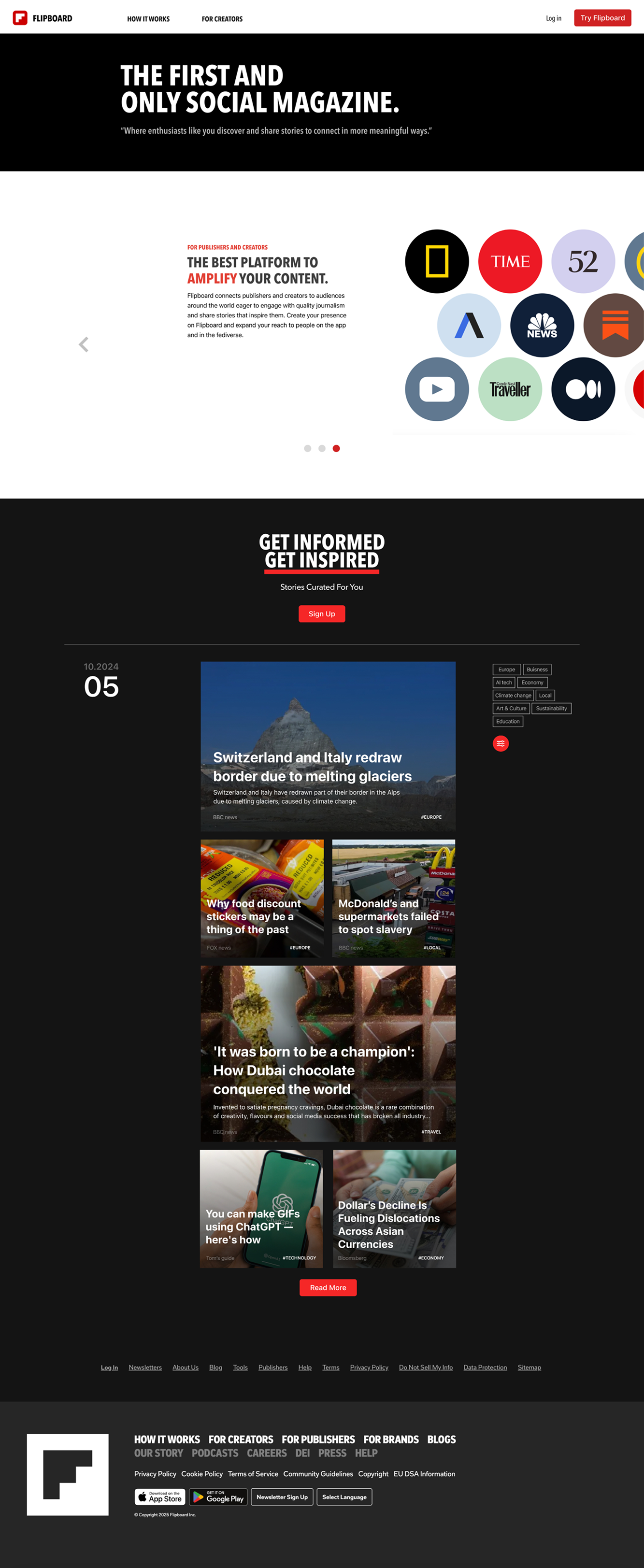
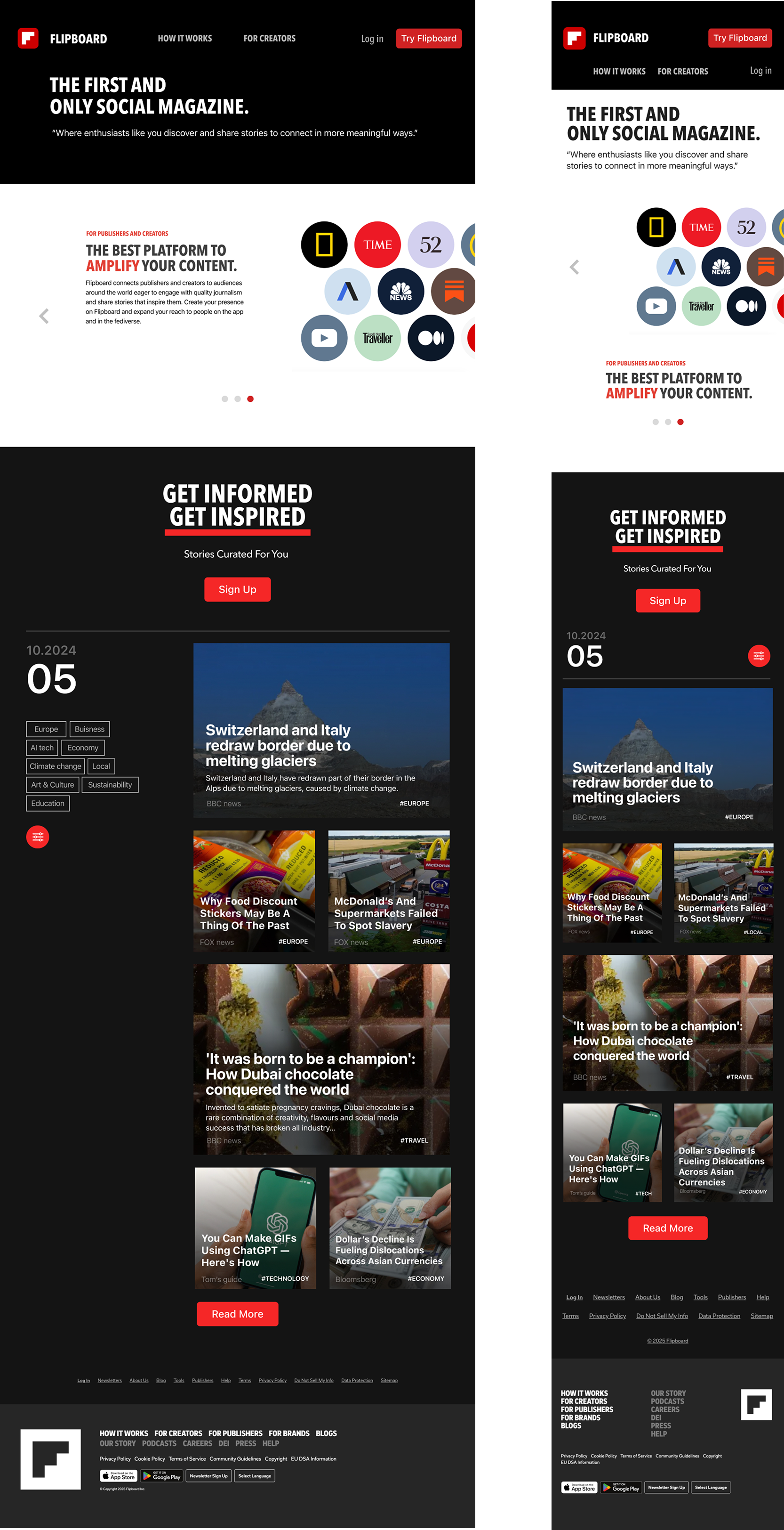
01/ Hidden Contents Access
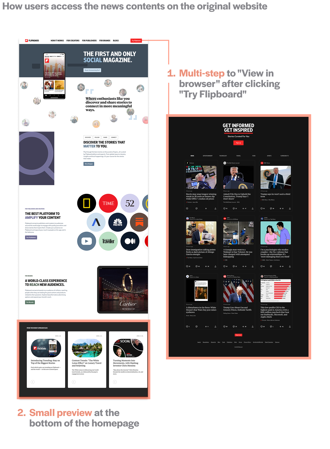
Even though Flipboard have a web version, it’s hard to find. Most users only see what looks like an app promotion page, and the option to browse content is hidden behind several steps.
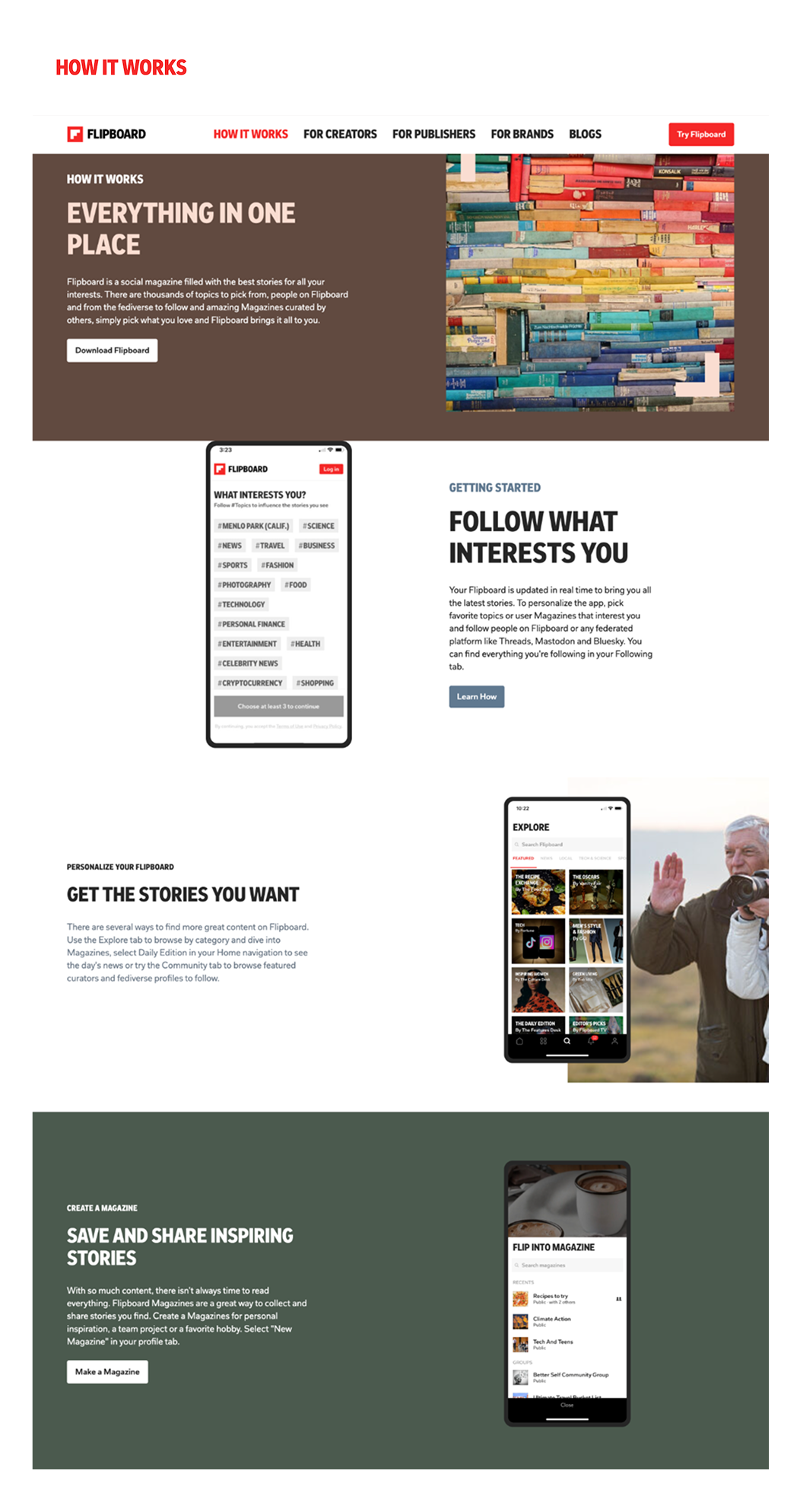
02/  Repetition Weakens the Purpose of the Homepage
The homepage repeats much of the same content as thesub page—mostly descibing the feature of app instead of showing what users expect from flipboard.
Visual Consistency Issue
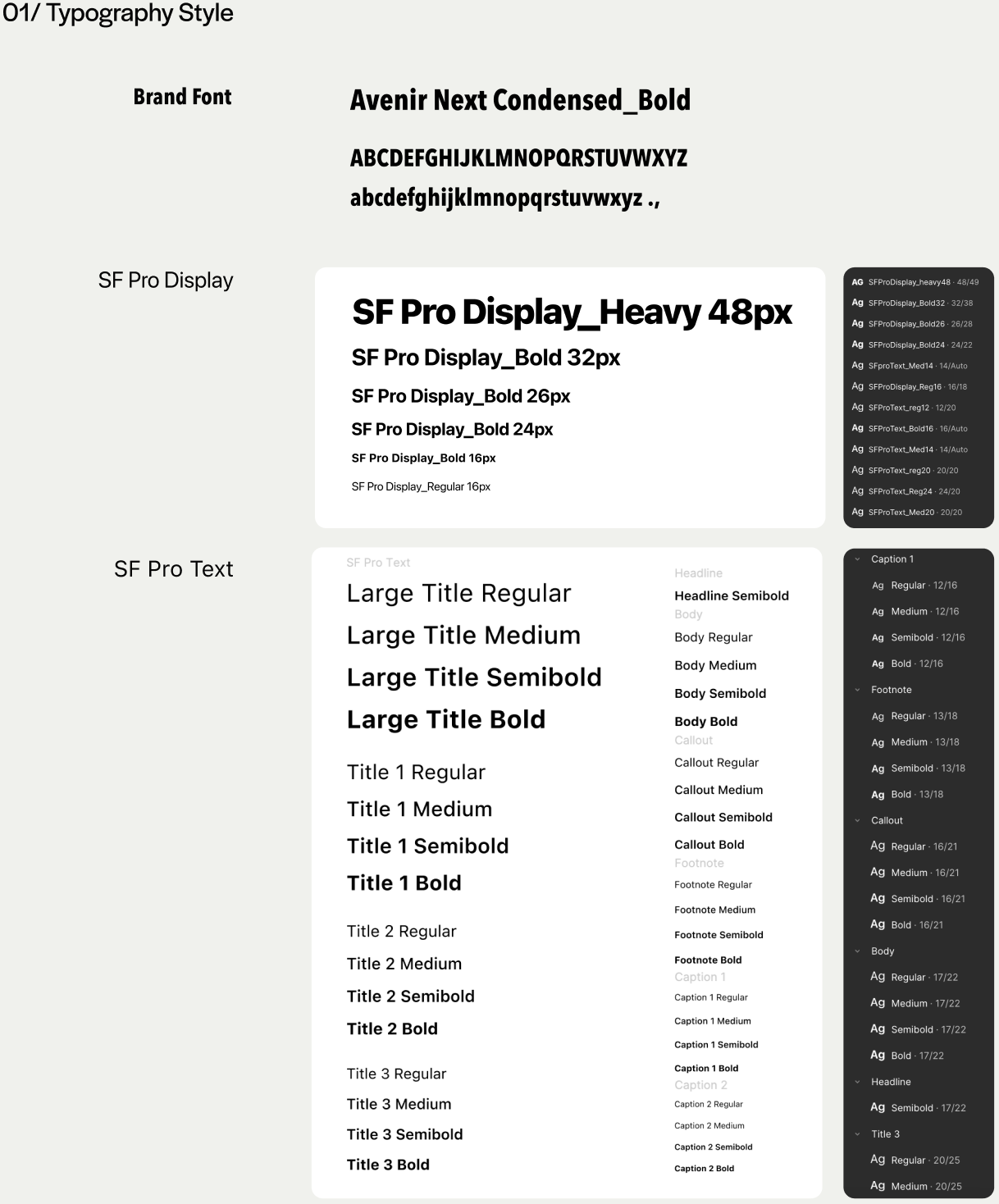
Typography
Multiple font styles are used across headings, body text, and UI elements, weakening the visual hierarchy.
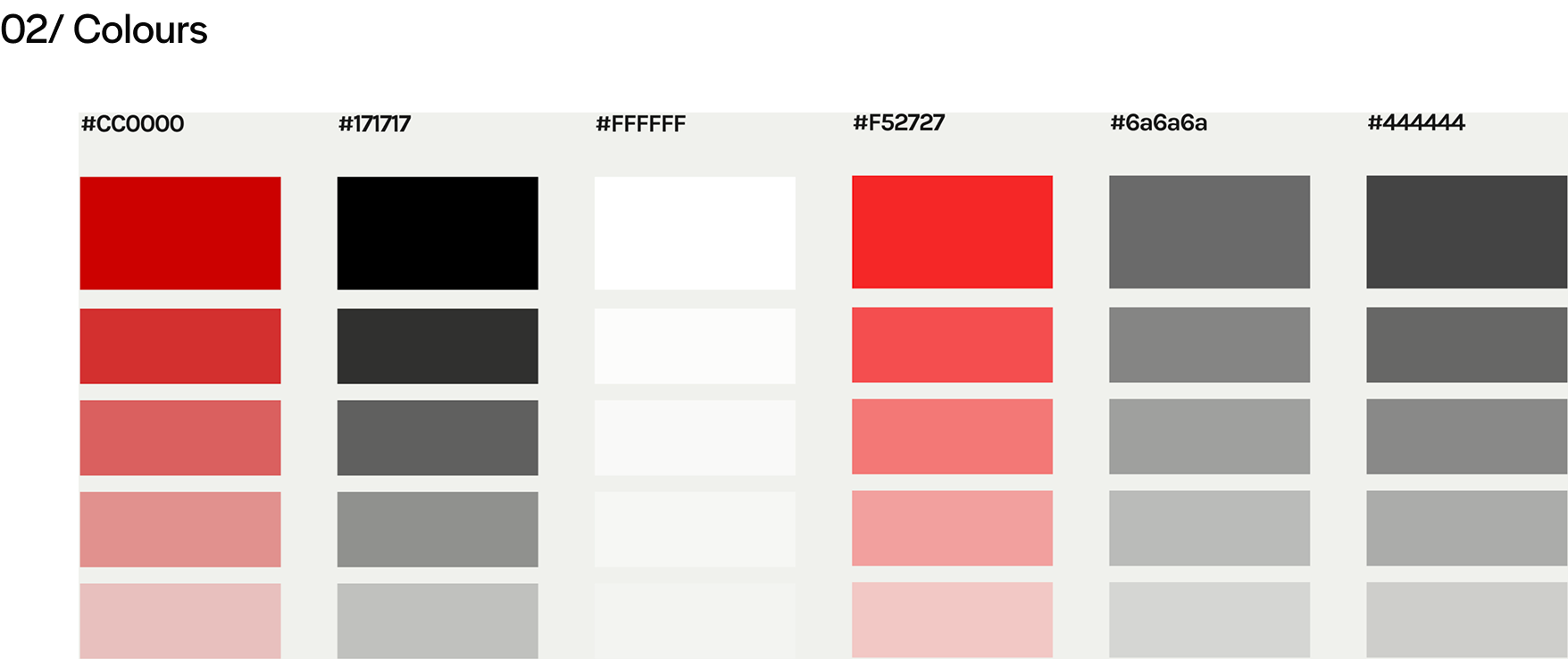
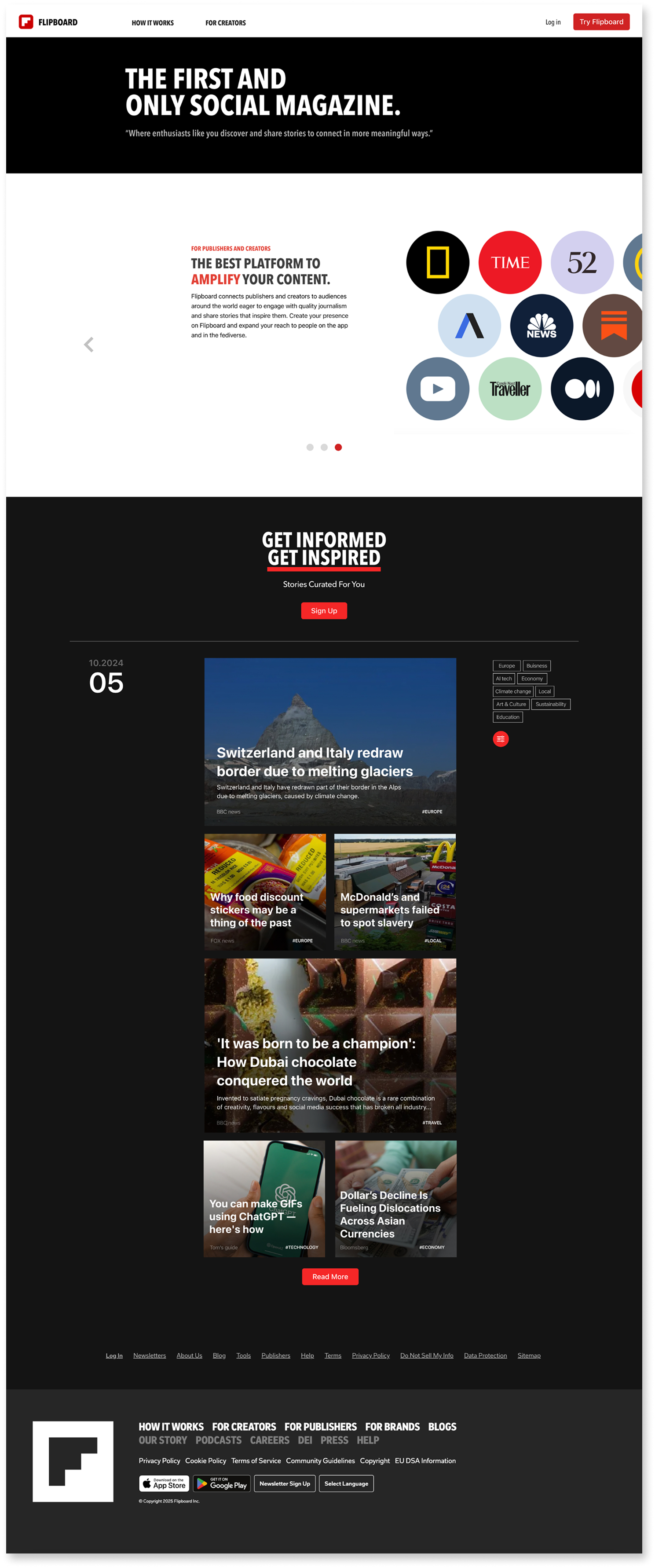
Overuse of UI Colors
In addition to being image-heavy, the site has too many colors. This creates visual noise and distracts from the actual content.
Emphasis Styles
Text is highlighted in various ways—background color, bold, colored text, boxes. Users feel confuse what should stand out.
Wireframing
This redesign introduces a content-driven homepage that brings the magazine browsing experience to the forefront. The layout is fully responsive and optimized for desktop, tablet, and mobile devices, allowing users to engage with Flipboard in a more immediate and intuitive way.
Design system
High fidelity Wireframing
User Testing Feedback
High fidelity Design
01/ Page organized with Scroll Interaction
Instead of the long scroll-based layout and repetitive product introduction on the original homepage,
the redesign uses horizontal interaction to make better use of space.
It allows new users to see a clear introduction to the Flipboard app while also experiencing the brand’s news identity through the web version.
02/ More efficient layout for users to access the contents
Flipboard have a web version, but it's hidden behind several steps.
Most users only see what looks like an app promotion page.
Responsible Web Design
Before
After
Reflection
Rethinking the Website’s Role
When I first started this project, I assumed that Flipboard didn’t offer a web-based content experience at all. Based on the homepage, it looked like the site was only promoting the mobile app—so I initially began designing a standalone content browsing page.

But as I explored further, I discovered that the web version did exist—it was just difficult to find due to how the user flow and structure were set up. That moment shifted the entire direction of the project. The issue wasn’t the absence of functionality, but the lack of clarity and visibility in how that functionality was presented. This realization taught me that users—and even designers—can make incorrect assumptions when information isn’t clearly surfaced. From that point on, the focus of the redesign became about highlighting value, supporting user expectations, and giving the homepage a more meaningful role in the experience.

Through this process, I learned that UX isn’t always about creating new features—it’s often about helping users better access what already exists.
User Needs Insight
User testing revealed two recurring themes:
- New users needed a simple, upfront explanation of what Flipboard is.
- Users across devices expected a consistent and predictable layout, especially in the top navigation area.


These needs reinforced the importance of designing for clarity, not just style.
 By directly addressing these insights in the redesign—through restructured content, simplified navigation, and responsive layout